

How Popcorn Boxes Actually Build Your Brand (UK)
Popcorn packaging carries more brand weight than most sellers give it credit for, mostly because the category comes with a convention almost every customer already recognises before they read a single word on the box. Understanding where that convention came from, and when to use it versus deliberately break it, does more for a popcorn brand than generic “make your packaging pop” advice ever will.
Where the stripe came from, and why it still works
The red-and-white striped popcorn box is not a modern marketing invention. It traces back to 1930s cinema concession stands, where popcorn moved from plain paper bags into printed boxes as it became a fixture of the movie-going experience, and cardboard boxes were the standard serving vessel by the late 1940s. Decades on, that stripe is one of the most recognisable pieces of visual shorthand in food packaging: a customer sees it and reads “cinema treat” before processing anything else on the box.
That is exactly why the real decision is not “should I use stripes,” but “do I want that association or not.” Leaning into the stripe borrows decades of built-in recognition for free, useful for a genuinely nostalgic, classic or family-treat positioning. Deliberately breaking from it, plain kraft, a single bold colour, a modern minimal print, signals the opposite on purpose: artisan, premium, not the multiplex. Neither choice is automatically right; picking one without knowing what you are signalling is the actual mistake.
The advantage most categories don’t get: let them see it
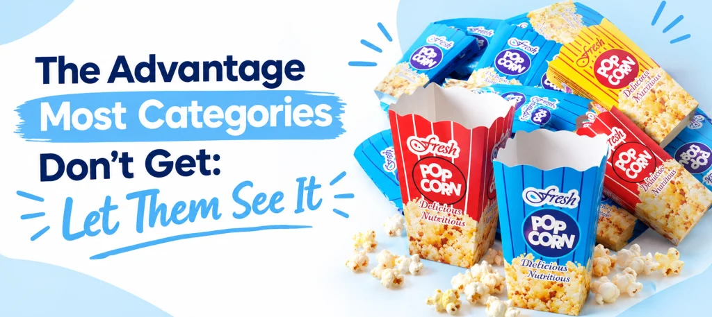
A closed, opaque box is the default for a lot of packaged food, and popcorn is one of the categories where that default gives away a real advantage. Colour, glaze on a kettle corn or caramel variety, and the sheer fluffiness of the product are all things a customer can judge by eye if the packaging lets them, and popcorn is unusually good at looking appealing through a window. A die-cut window or a clear panel turns the product itself into part of the packaging’s sales pitch, something a brand selling something visually plainer cannot lean on nearly as effectively.
“Heat resistant” is a real requirement, not a marketing word
Some packaging copy throws “heat resistant” into a features list without explaining what it actually means, which is a shame, because for popcorn it is a genuine, specific requirement rather than a vague reassurance. Popcorn is often boxed while still warm, and a board that is too light for that job can soften, warp or lose its crisp printed look under the heat, which undermines a premium brand impression fast. As general industry orientation, a heavier-weight board is commonly used specifically to hold its shape and insulate against that warmth, a different job entirely from grease resistance, which comes from a separate coating or a naturally grease-resistant material such as kraft. A box that handles heat well but still lets grease through, or the reverse, has only solved half the problem.
Turning this into an actual brand decision
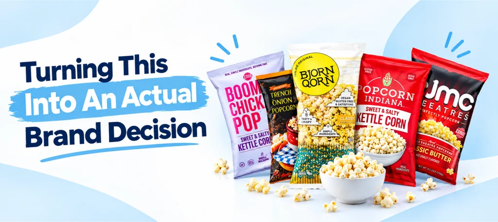
Put together, a popcorn box that is genuinely doing branding work makes three deliberate choices, not one default: whether it leans into or breaks from the stripe convention, whether a window shows the product rather than hiding it, and whether the board and coating are actually specified for the heat and grease the product brings, rather than assumed to be fine because the box looks right on screen.
Frequently asked questions
Why are popcorn boxes traditionally red and white striped?
The convention traces back to 1930s cinema concession stands, where striped boxes replaced plain paper bags as popcorn became a fixture of the movie-going experience. Cardboard boxes were standard by the late 1940s, and the stripe has stayed a recognisable cinema-culture cue ever since, which is why it still reads as “classic movie treat” today.
Should my popcorn brand use the classic stripe or something different?
It depends on what you want the box to say. The stripe borrows decades of built-in recognition and suits a nostalgic, family or classic-treat positioning. Breaking from it, plain kraft, a bold single colour or a modern minimal design, signals a deliberately different position: artisan, premium or simply not trying to look like a cinema concession stand. Choose on purpose rather than by default.
Does a window in popcorn packaging actually help sales?
It can, because popcorn is a product where colour, glaze and texture are genuinely visible selling points, unlike many packaged foods. A window or clear panel lets the product argue for itself at the point of sale, an advantage a fully opaque box gives away for no real reason.
What does “heat resistant” popcorn packaging actually mean?
It means the board is heavy and rigid enough to hold its shape and resist warping when the popcorn inside is still warm, rather than softening or losing its printed finish. It is a separate requirement from grease resistance, which depends on the material’s coating or natural properties, not its weight or heat performance.
Is grease resistance the same as heat resistance for popcorn boxes?
No, and treating them as one thing is a common mistake. Heat resistance is about the board holding its shape and finish against warmth; grease resistance is about stopping oil or butter soaking through, which comes from a coating or a naturally resistant material. A box can genuinely need both, specified separately, not assumed to come as one package.
Whether you want the classic stripe, a window that shows off the product, or a board properly specified for heat and grease, our Popcorn Boxes range covers the format. Ask our design team about a window panel or a heavier board weight for your specific recipe.