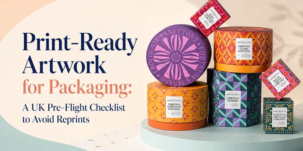
Print-Ready Artwork for Packaging: A UK Pre-Flight Checklist to Avoid Reprints
Print-ready packaging artwork means a vector or 300 DPI file, built in CMYK (not RGB), sized exactly to the dieline with 3mm bleed (5 to 10mm on rigid boxes), a 3mm safe zone inside every cut line, and fonts outlined before export. Save as a print-ready PDF, AI or EPS, never a Canva PNG or JPEG straight off a phone. Get these six things right and your box comes off press looking like the file you approved, not a rough guess at it.
Most artwork problems never show up on screen. They show up three weeks later, when 500 boxes arrive with a logo cropped by the fold, or colours that looked navy on your laptop and print as bruised purple. We see the same handful of file mistakes on repeat at our prepress desk, and every one of them is avoidable before you ever hit upload.
This guide is the pre-flight checklist we actually run on incoming artwork, in the order we check it. If your file passes all of it, it is genuinely print-ready. If it doesn’t, better to fix it now than after the dies are cut.
One thing before we start. A dieline and print-ready artwork are not the same thing. The dieline is the shape your box folds and cuts to; artwork is what you design on top of it. If you haven’t nailed down what a dieline actually is yet, our guide to what a dieline is in packaging covers that first step. This post picks up from there.
The pre-flight checklist: what we check before a file goes to press
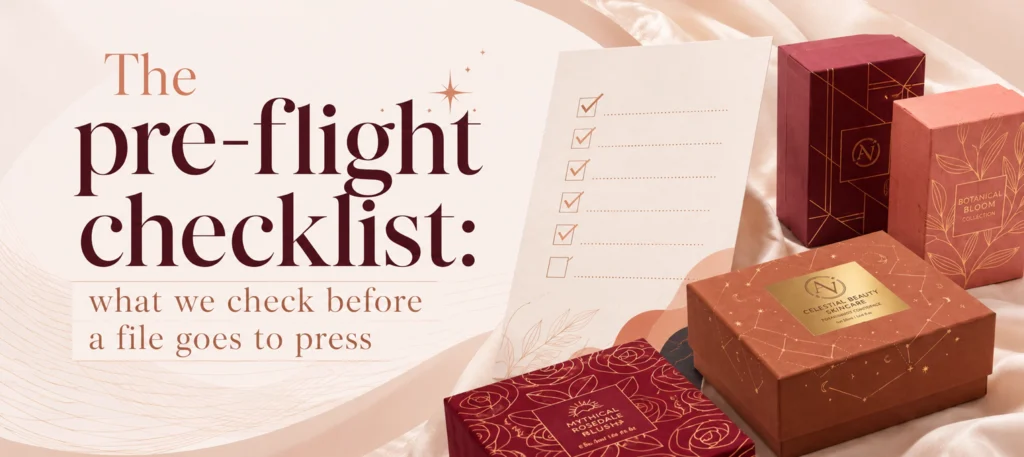
Run through these ten points before you submit artwork for any custom box. We check them in this order because each one can hide problems the next one would otherwise catch.
- File built on the exact dieline supplied, at 100% scale, not resized or eyeballed.
- Bleed extended 3mm past every cut line (5 to 10mm on rigid boxes, because the wrap-around board needs more coverage at the corners).
- Safe zone kept clear: no text, logos or barcodes within 3mm of a cut or fold line.
- Colour mode set to CMYK, converted before you start designing, not at the end.
- Spot colours (Pantone) specified by name for any colour that has to match exactly, such as a brand logo.
- Images placed at 300 DPI at final size, not stretched up from a smaller web image.
- All fonts outlined or embedded so nothing substitutes on someone else’s machine.
- Dieline layer set to a spot colour or non-printing layer, clearly separated from the artwork layer, and removed or switched to knockout before final export.
- File exported as PDF/X-4, AI or EPS, flattened where the software asks you to.
- One last check against the actual dieline, side by side, before you hit send.
Ticking all ten doesn’t guarantee perfection. It does mean the file will not bounce back from prepress with a query, which is where most turnaround delays start.
CMYK vs RGB: why your screen is lying to you
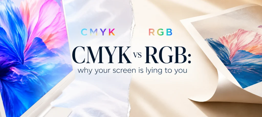
Here’s the bit almost nobody explains properly before a customer’s first order goes wrong. Your screen builds colour with light. Red, green and blue light mix together and add up to white, which is why designers call it an additive colour model. A press builds colour with ink on paper, where cyan, magenta, yellow and black lay down and subtract light, which is why print uses a subtractive model, CMYK.
The two models don’t cover the same range of colour, known as their gamut. RGB screens can show a wider range of bright, saturated colours than four-colour litho or digital print can reproduce, especially in vivid blues, greens and oranges. Convert an RGB file to CMYK at the last minute and those colours fall back to whatever is closest inside the smaller CMYK gamut. That is why a shade that looked electric on your laptop can print duller and slightly shifted.
Illustrative gamut comparison (not to scale): RGB screen gamut ≈ full range | CMYK print gamut ≈ roughly 70 to 80% of that range, with the steepest drop in saturated blues, greens and fluorescents. Skin tones and most browns and greys survive the conversion with barely any visible shift.
The fix is simple and worth repeating: design in CMYK from the first mouse click, not as a last-minute export setting. If your logo has one exact brand colour that has to match every time, specify it as a Pantone spot colour rather than trusting a CMYK build to hit it consistently. And if a colour genuinely has to be perfect, ask your supplier for a physical proof before the full run goes to press. A screen, however well calibrated, is still a guess.
Bleed and safe zone: why rigid boxes need more room than folding cartons
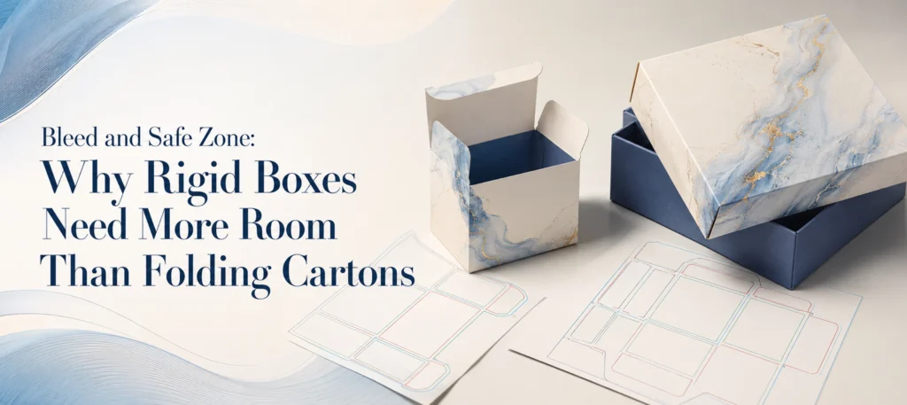
Bleed is the extra artwork that runs past the cut line, so that any tiny movement in cutting doesn’t leave a sliver of white edge. For most folding cartons and mailer boxes, 3mm of bleed on every edge is the standard we work to.
Rigid boxes are different. Because the printed paper wraps around a separate rigid board and folds over the edges, we ask for 5 to 10mm of bleed depending on the box size, so the wrap has full coverage at every corner. Skip this and you get a thin unprinted strip exactly where the lid meets the base, which is the single most common rigid-box complaint we field.
Safe zone works the other way round: it’s the margin inside every cut and fold line where nothing important should sit. Keep text, logos and barcodes at least 3mm clear of any cut line and comfortably clear of fold lines too, since folding is never pixel-perfect at scale. A logo that’s 2mm from the edge in your file might print with half its outline missing.
Resolution, fonts and file formats that survive prepress
Resolution: every raster image (a photo, a texture, a scanned illustration) needs to sit at 300 DPI at the size it will actually print, not the size it started at on a website. A 72 DPI hero photo pulled off Instagram might look sharp on a laptop and turn to visible mush the moment it’s blown up to cover a box face.
Fonts: outline your fonts (convert text to shapes) or embed them fully before export. If you don’t, whoever opens your file next may not have the same font installed, and the software will silently substitute something else, usually without warning you.
File format: the safest export is a print-ready PDF built to the PDF/X-4 standard, an internationally recognised prepress format (ISO 15930-7) designed specifically to carry colour-managed, CMYK-ready print files without ambiguity. AI and EPS are also fine, because both keep artwork as scalable vectors rather than a fixed grid of pixels. What we’d steer you away from: a PNG or JPEG exported straight from Canva, PowerPoint or a phone screenshot. These are raster files with no bleed built in and often carry an RGB colour profile that will shift on press.
Worth knowing: if you designed in Canva or Figma, both let you export a “print” or high-quality PDF rather than the default web export. Use that option, then double-check the exported file still has your bleed and colour settings intact, because some free-tier exports strip both. quote page
Common artwork mistakes we see every week
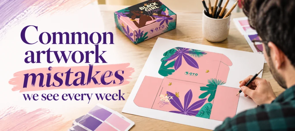
| Mistake | What it causes | The fix |
|---|---|---|
| File left in RGB | Colours shift, sometimes badly, on press | Convert to CMYK before you start designing |
| No bleed added | Thin white line at the trimmed edge | Extend background and colour blocks 3mm past the cut line (5 to 10mm on rigid) |
| Text or logo too close to the cut or fold | Cropped or partially folded-away content | Keep everything 3mm clear of cut lines, more from fold lines |
| Low-resolution images | Blurry, pixelated print, especially on photography | Source or shoot images at 300 DPI for final print size |
| Fonts not outlined | Wrong font substituted silently at prepress | Outline text or embed fonts fully before export |
| Dieline left visible or printing | A stray red or blue line prints on the finished box | Set the dieline to a non-printing spot colour, remove before final export |
| File exported as PNG/JPEG from Canva or a phone | No bleed, wrong colour profile, soft edges | Export as a print-ready PDF, AI or EPS instead |
| Artwork resized to “roughly fit” a different dieline | Panels misaligned, wrap doesn’t line up with folds | Always build on the exact dieline supplied for your box, at 100% scale |
| Assuming a screen match guarantees a press match | Colour surprise on delivery, especially for exact brand colours | Specify Pantone spot colours for anything that must match exactly, and ask for a physical proof |
| Skipping the final side-by-side check against the dieline | Small errors reach production because nobody looked twice | Always do one last comparison against the actual dieline before sending |
If your file trips more than two or three of these, it’s worth a second pair of eyes before you commit to a full print run. This is exactly what free artwork proofing exists to catch, and a good supplier will flag it rather than print it as supplied.
What happens after you submit: proofing and physical samples
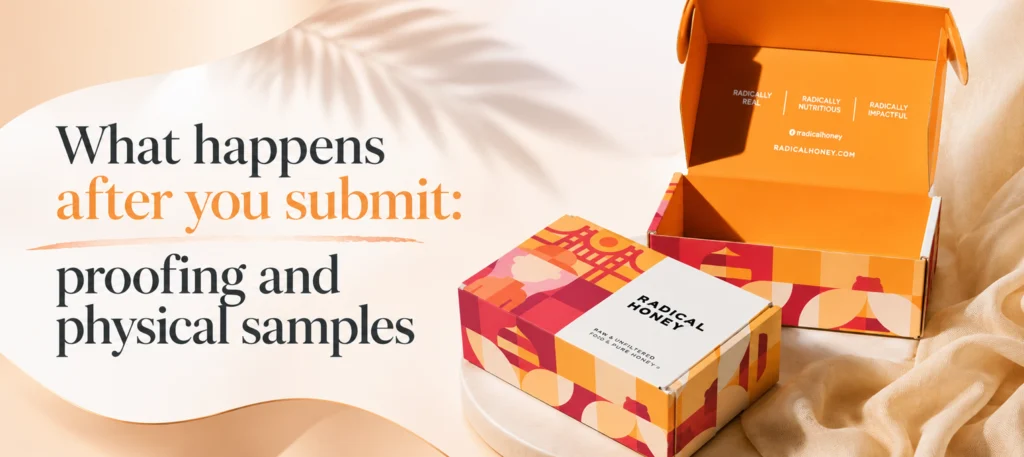
A print-ready file still goes through a human check before it reaches a press. At All Custom Packaging, every order includes free design support and proofing, so if your bleed is short or your fonts aren’t outlined, we flag it and fix it with you rather than printing it as submitted. There’s no setup fee for this, and it happens whether your order is 100 units or several thousand.
Before a bulk run goes ahead, you get a video or physical sample approval on the actual box, not just a screen mock-up. That step exists precisely because screens and press output don’t always agree, and catching a colour or scale issue on one sample is far cheaper than catching it on the full order. Turnaround from approved artwork to delivery typically runs 6 to 8 business days, with free UK delivery on qualifying orders.
Frequently Asked Questions

What does “print ready” actually mean for packaging artwork?
It means the file is built to the exact dieline at 100% scale, in CMYK colour, with the correct bleed (3mm standard, 5 to 10mm for rigid boxes), a clear safe zone, images at 300 DPI, fonts outlined, and saved as a vector or high-resolution format such as PDF, AI or EPS. A file missing any of these usually needs correcting before it can go to press.
Why does my design look different on screen than it does printed?
Screens build colour with light (RGB), which can show a wider range of bright colours than CMYK printing ink can reproduce. When an RGB file converts to CMYK, saturated blues, greens and oranges are the colours most likely to shift or dull slightly. Designing in CMYK from the start, rather than converting at the last minute, reduces the surprise.
How much bleed does packaging artwork need?
Standard folding cartons and mailer boxes need 3mm of bleed on every edge. Rigid boxes need more, typically 5 to 10mm depending on box size, because the printed wrap has to fully cover the board at every corner and edge.
Do I need to outline my fonts before sending artwork to print?
Yes. Outlining converts text into shapes so the design displays correctly on any computer, even one without your font installed. Skipping this step is one of the most common reasons a file gets silently altered before it reaches a press.
Can I submit a PNG or JPEG file for packaging print?
It’s not recommended. PNG and JPEG are raster formats that don’t carry bleed information and are often saved in an RGB colour profile, both of which cause problems at prepress. A print-ready PDF, AI or EPS file keeps your artwork as scalable vectors with the correct colour mode built in.
Is the dieline supposed to be visible on my finished artwork?
No. The dieline should sit on its own non-printing layer as a guide for where cuts and folds fall. It needs to be removed, or set so it doesn’t print, before you export your final file, otherwise a stray line will appear on the finished box.
Key takeaways
- Build on the exact dieline, in CMYK, with 3mm bleed (5 to 10mm for rigid boxes) and a 3mm safe zone.
- Design in CMYK from the start; converting from RGB late is what causes colour surprises on press.
- Images need to sit at 300 DPI at final size, and fonts need outlining before export.
- Export as a print-ready PDF (PDF/X-4), AI or EPS, never a raw PNG or JPEG.
- Free proofing and a physical or video sample approval exist to catch what a screen can’t. Use them.
Every order at All Custom Packaging print finishes guide includes free design support and artwork proofing from 100 units up, with no setup fees and a video or physical sample before your bulk run goes to press. If you’d like us to check a file before you commit to a full order, send it over for a free review and we’ll flag anything that needs fixing before it costs you a reprint.