
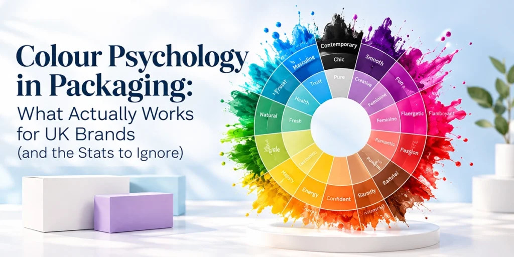
Colour Psychology in Packaging: What Actually Works for UK Brands
Quick answer: Colour psychology in packaging is real, but weaker and more context-dependent than most marketing blogs claim. Peer-reviewed research supports three things: colour shapes first impressions of brand personality (red reads as exciting, blue as competent), colour sets flavour and quality expectations before anyone opens the box, and consistent colour helps shoppers find you again on a shelf or feed. The famous stats “85% of purchase decisions are based on colour”, “colour increases brand recognition by 80%” don’t survive a source check. Choose packaging colours by category convention, contrast against competitors, and print reality on your chosen board, not by a universal colour-meaning chart.
You’ve probably seen the infographic. Red means excitement, green means health, purple means luxury, and somewhere near the top sits a claim that 85% of buying decisions come down to colour. Almost every page ranking for this topic repeats those numbers. We checked where they actually come from. Most of them fall apart.
That matters if you’re a UK small brand about to commit to 500 printed boxes. So this guide does two jobs. First, it separates what colour research genuinely shows from recycled myth. Second, it gets practical: UK category conventions, standing out versus fitting in, how colour behaves on kraft versus white board, and keeping your brand colour consistent across reorders.
The stats everyone quotes and what checking them turns up
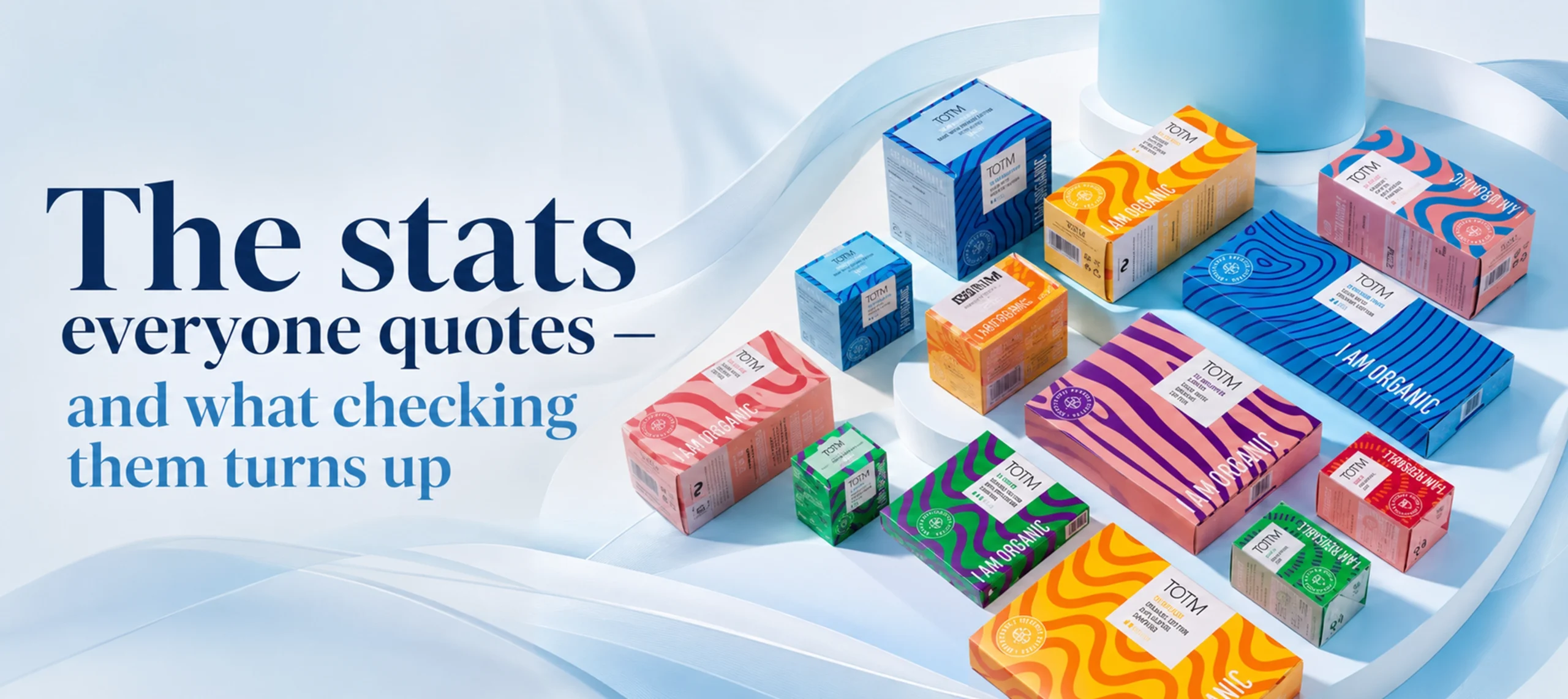
Three claims dominate colour psychology articles. Here’s what happened when we traced each one to its source.
| Claim you’ll see everywhere | Where it actually comes from | Verdict |
|---|---|---|
| “85% of consumers say colour is the primary reason they buy” | Colorcom / CCICOLOR, a colour consultancy. No published methodology, sample or peer review has ever surfaced. | Unverifiable don’t build decisions on it |
| “Colour increases brand recognition by 80%” | Traced by print-industry researchers at insights4print to a 2005 Xerox marketing leaflet citing a Loyola University Maryland study. The underlying study compared colour print against black-and-white nothing to do with choosing between colours. | Debunked as commonly used |
| “People judge products in 90 seconds, and 62–90% of that assessment is based on colour alone” | A real academic paper Singh (2006), Management Decision but the figure inside it traces back to the same commercial colour-consultancy claims, not a controlled study. | Weak provenance quote with caution, or not at all |
Worth knowing: the paper trail on these claims is short. Once you get past the blogs citing other blogs, you hit a consultancy press release or a photocopier leaflet. That doesn’t mean colour doesn’t matter. It means the industry has been decorating a true idea with fake precision.
What the research actually supports

Strip away the recycled stats and a smaller, more useful body of evidence remains. Three findings are solid enough to act on.
1. Colour signals brand personality before a word is read
Labrecque and Milne (2012), published in the Journal of the Academy of Marketing Science, ran four studies mapping colours onto perceived brand personality. Red reliably raised perceptions of excitement. Blue raised perceptions of competence and reliability. Saturation and lightness amplified or softened those effects.
The practical part: congruence beat any single “best” colour. Brands whose colour matched their intended personality were liked more and better remembered. A playful sweets brand in sober navy sends a mixed signal. So does a cyber-security firm in bubblegum pink.
2. Colour sets taste and quality expectations
Charles Spence’s crossmodal research group at Oxford has shown repeatedly that packaging colour changes what people expect and even report a product tastes like. In one study, Piqueras-Fiszman and Spence gave people crisps in deliberately mismatched packet colours. Participants struggled to identify flavours when the packet colour clashed with the contents. A related 2012 study found the colour of a cup changed how people rated the drink inside it.
For food, drink, candles and cosmetics, this is the finding that earns its keep. Your packaging colour is making a promise about the product. Break that promise and the product itself gets judged worse.
3. Consistent colour is a memory shortcut
Distinctive-asset research from the Ehrenberg-Bass Institute frames colour as a branding device, not a persuasion device. A colour you own consistently. Cadbury purple, Selfridges yellow lets shoppers find and recognise you faster. The value comes from consistency over years, not from any inherent meaning of the hue.
One caveat here. Owning a colour legally is hard. Cadbury spent a decade in UK courts over Pantone 2685C and still holds only narrow protection. You don’t need a trademark to benefit, though. You need repetition.
UK category colour conventions: the shelf you’re joining
Colour meanings aren’t universal. They’re learned from the shelves shoppers already walk past. That’s why the same green reads as “organic” on a soup carton and “menthol” on other products. Before choosing, map your category’s conventions.
| UK category | Convention on shelf | Why it holds | Room to break it? |
|---|---|---|---|
| Everyday food & snacks | Red, yellow, warm tones | Learned association with appetite and value; decades of supermarket reinforcement | Moderate flavour cues must stay conventional (salt = blue in crisps, cheese = green… UK-specific quirks) |
| Organic / health food | Greens, kraft brown, muted earth tones | Signals “natural”; unbleached kraft literally shows the fibre | Low shoppers scan for these cues to find the category |
| Luxury & premium gifting | Black, deep navy, gold/foil accents, heavy coverage | Darker, low-saturation palettes read as expensive (consistent with Labrecque & Milne’s saturation findings) | Low for black itself; high for the accent colour |
| Cosmetics & skincare | White, blush, sage, minimal palettes | Cleanliness and “clinical calm”; white space signals confidence | Moderate bold colour-blocking is a growing UK indie differentiator |
| Eco & refill brands | Kraft, single-colour ink, uncoated finishes | The material is the message; heavy ink coverage would undercut it | Low but see the greenwashing note below |
| Tech & gadgets | White, grey, single accent colour | Apple-led minimalism became the category default | High the field is so uniform that colour stands out fast |
| Children’s products | High-saturation multicolour | Attention and shelf appeal to kids; parents expect it | Moderate |
A greenwashing note, because UK rules have teeth: kraft-and-green styling implies an environmental claim. Under the CMA’s Green Claims Code, implied claims need substantiating just like written ones. Don’t dress a non-recyclable laminated box in eco colours. Check GOV.UK for the current guidance before making any environmental claim on pack.
Standing out vs fitting in: the real strategic choice

Category conventions create a trap. Follow them completely and you’re invisible in the line-up. Ignore them completely and shoppers can’t tell what you sell.
The working rule we suggest to customers: fit the category, break the palette. Keep the cues that say what you are kraft for eco, appetising warmth for food then pick one element that contrasts hard with the three brands you’ll sit next to. That might be an unexpected interior print colour, a single accent that nobody nearby uses, or full-coverage colour in a category full of white.
Do the shelf test before you commit. Screenshot your top competitors’ packaging, drop your draft design among them, shrink to thumbnail size. If you can’t spot yours in two seconds, the palette needs more contrast. If you can’t tell what category it belongs to, it needs more convention.
Unboxing changes the maths for e-commerce brands. On a courier’s van your box competes with nobody, so the outside can whisper. The reveal interior print, tissue, contrast between shipping box and product box is where colour earns social shares. We see this a lot with candle and jewellery brands: plain exterior, saturated interior, and the unboxing photo does the marketing.
Colour on kraft vs white board: the print reality nobody mentions
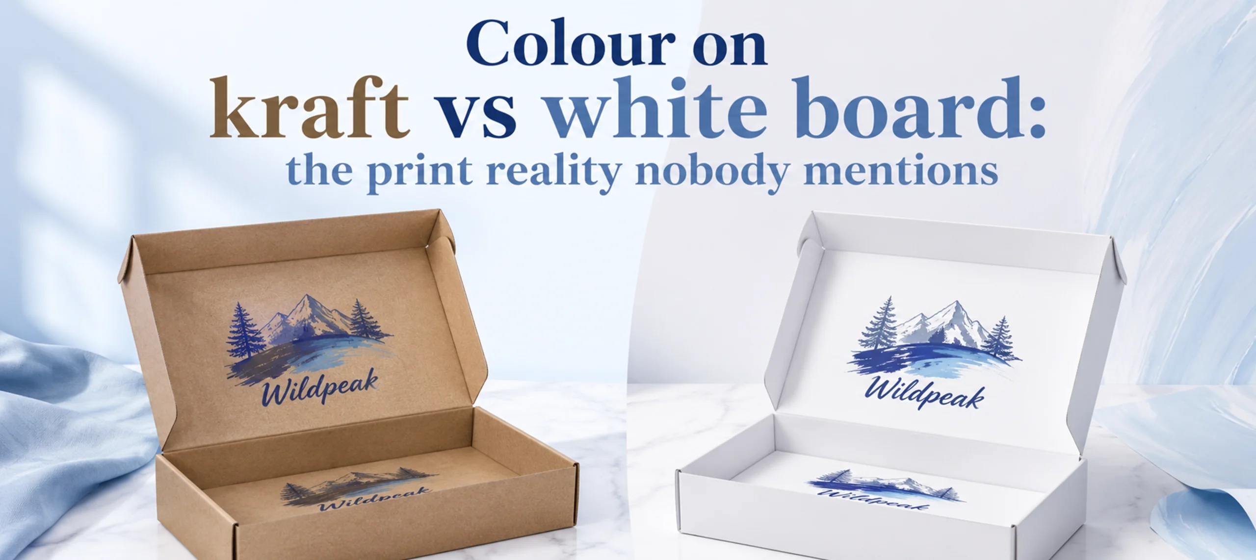
Colour psychology articles pick colours on a screen. Boxes get printed on board, and the board changes everything.
Kraft board is brown. Every ink you print on it is tinted by that brown. Whites go cream, blues drift toward slate, yellows go mustard, and pastels mostly vanish. There’s no white ink in standard CMYK printing, so anything pale relies on board colour that isn’t there.
What works on kraft: black, deep reds, dark greens, navy, and designs that use the brown itself as a colour. What disappoints: brand-critical light colours, skin tones, and large photographic areas.
White board (or a white-top kraft) gives you an accurate canvas. Colours print true, fine gradients survive, and pale brand palettes stay pale. The trade-off is that you lose the instant “natural” signal kraft carries.
If your brand colour is non-negotiable say a precise duck-egg blue white board is the safe call. If your positioning is eco-first and your palette is dark and simple, kraft will flatter it. We’ve written a full comparison of the two boards, covering cost and sustainability as well as print (see our kraft vs white guide).
One practical tip from our proofing desk: the most common surprise we see is a customer approving a bright screen mock-up, then receiving a kraft proof that prints two shades darker and warmer. Always ask for a printed proof or production video on kraft jobs before the bulk run. At All Custom Packaging that check is built in before anything goes to press.
Pantone consistency: keeping your colour the same at reorder five
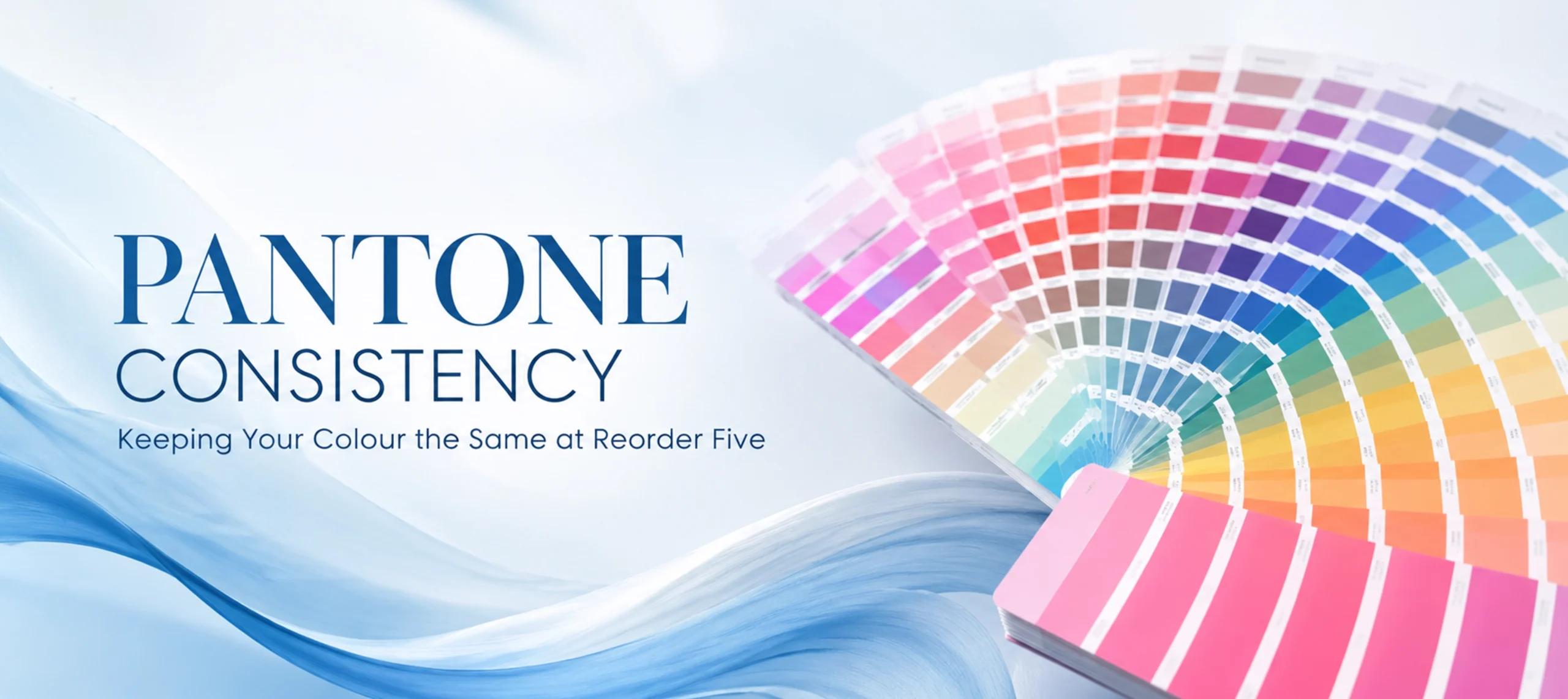
A colour strategy only works if the colour stays the same. Reorder drift this batch’s red not quite matching last batch’s quietly erodes the recognition you’re paying to build.
How to protect yourself:
- Specify a Pantone reference, not a screen colour. “Our red” means nothing; Pantone 186C means the same thing to every printer. Pantone is the industry’s standard colour-matching system a numbered library of exact ink recipes.
- Know the difference between spot colour and CMYK. Digital and most short-run printing builds your colour from four inks (CMYK), which gets close to a Pantone reference but not identical. True spot-colour ink is usually a litho or offset process at higher volumes. Prices vary by size, quantity and print method, so ask which process your quote assumes.
- Keep a physical reference. Hold back a box from each approved batch. Screens lie; a box under daylight doesn’t.
- Expect substrate shift. The same ink reads differently on coated white, uncoated white and kraft. If you print across several products, match by eye on each substrate once, then lock those values.
- Reorder with the same spec sheet. GSM (board weight), finish and ink build all nudge colour. Changing “just the board” changes the colour too.
Accessibility: contrast is a sales issue, not a compliance chore
Roughly 3 million people in the UK are colour blind around 1 in 12 men and 1 in 200 women, according to Colour Blind Awareness. Add anyone reading your box in a dim hallway or a thumbnail product photo, and low contrast starts costing you customers.
Practical checks that take minutes:
- Run your palette through a free contrast checker (WCAG guidance suggests 4.5:1 for small text). Your ingredients list and allergy information deserve the same care as your logo.
- Never let colour alone carry meaning. If flavour variants differ only by pack colour, add the flavour name prominently.
- Test the design in greyscale. If the hierarchy collapses without colour, it was doing too much work.
- Red/green distinctions are the most common blind spot. Avoid using that pair as your only variant signal.
How to actually choose your packaging colours: a 6-step method
- Write down the two personality traits your brand must project (e.g. “calm, premium”). Check them against the evidence-backed associations: warm saturated colours for excitement and appetite, cool desaturated colours for competence and calm, dark low-saturation for premium.
- Photograph or screenshot your five closest UK competitors. Note the category conventions you must keep and the palette gap nobody occupies.
- Choose board first, colour second. Kraft or white changes which palettes are even possible.
- Pick one primary colour, one accent, and specify both as Pantone references.
- Run the shelf test at thumbnail size and a greyscale accessibility pass.
- Order a printed proof on the actual board before bulk production. Judge it in daylight, not under warehouse LEDs.
None of this needs a big-brand budget. Custom printing from 100 units means you can test a palette on a small run, see how it photographs and lands with customers, and adjust at reorder with free design support and a proof before anything is mass-produced. If you’d like a second pair of eyes on your palette against your category, send us your design for a free proof through our quote form.
FAQ

What is colour psychology in packaging? It’s the study of how packaging colours influence what shoppers expect and feel about a product. Genuine research supports effects on perceived brand personality, taste expectations and recognisability. The dramatic percentage claims attached to it are mostly unsourced.
What colour packaging sells best? There’s no universally best-selling colour, and any article naming one is guessing. Sales impact comes from fit: matching your category’s learned cues, contrasting with adjacent competitors, and staying consistent. A “best” colour in cosmetics would flop in snacks.
Why is so much food packaging red or yellow? Decades of reinforcement: UK shoppers have learned warm colours as appetite and value cues, so brands keep using them and the association strengthens. Crossmodal research also shows colour genuinely shifts flavour expectations, which makes congruent warm tones a safe choice for everyday food.
Does black packaging really look more premium? Broadly, yes dark, low-saturation packaging is consistently read as more expensive, and peer-reviewed work links darker, muted palettes with sophistication. But it’s a convention, not magic: in a category full of black boxes, black stops signalling premium and starts signalling ordinary.
Which colours print well on kraft boxes? Dark, saturated colours: black, deep red, forest green, navy. The brown board tints every ink, so pale colours and whites print muddy or vanish. If light or exact brand colours matter, choose white board or a white-top kraft.
How do I keep my packaging colour consistent between orders? Specify a Pantone reference, keep a physical sample box from each approved batch, reorder on an identical spec (board, GSM, finish), and ask for a proof whenever anything in the spec changes.
Key takeaways
- The three most-quoted colour statistics trace to consultancy claims or a photocopier leaflet. Don’t repeat them; don’t plan around them.
- Real evidence supports colour’s effect on brand personality perception, taste expectation and recognition through consistency.
- Choose colours against your UK category’s conventions: keep the cues that say what you are, break the palette where you sit on shelf.
- Board choice comes before colour choice kraft tints every ink, white prints true.
- Lock colours with Pantone references and physical batch samples to stop reorder drift.
- Contrast-check for the 3 million colour-blind UK shoppers; greyscale-test your hierarchy.