
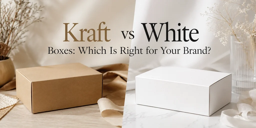
Kraft vs White Boxes: Which Is Right for Your Brand?
Choose kraft boxes if your brand feels natural, handmade or eco-led and your artwork uses dark, simple colours. Choose white boxes if you need accurate, bright colour printing and a clean, premium look. Both recycle in UK kerbside collections, and the price gap is usually only 10-15%. The print result is the real difference.
We print kraft and white boxes every day, often for the same customer. The question “should I go brown or white?” comes up on almost every quote call. It sounds like a small decision. It isn’t. The same artwork can look warm and artisan on one board and washed out on the other.
This guide covers what actually separates the two: the print results, the honest sustainability picture, the costs in pounds, and a simple way to match the board to your brand’s personality.
Worth knowing before we start: this is a choice about surface and colour, not box construction. If you’re weighing up box types rather than board colour, our guide to folding cartons vs rigid boxes covers that separately.
The 30-second decision table
If you only read one part of this post, make it this table. It’s built from the jobs we see go right (and occasionally wrong) on our own presses.
| Your situation | Better choice | Why |
|---|---|---|
| Brand feels rustic, artisan or handmade | Kraft | The brown fibre texture does half your branding for you |
| Brand is minimalist, clinical or luxury | White | Clean base, crisp edges, gallery feel |
| Artwork is a dark logo plus text | Kraft | One-colour dark print on kraft looks intentional and smart |
| Artwork has photos, pastels or exact brand colours | White | CMYK stays true to your proof on a white base |
| Tightest possible budget | Kraft | Skips bleaching, usually 10-15% cheaper like for like |
| Your eco story is recycled content | Kraft | Typically higher recycled fibre; say the percentage |
| You want recyclable but bright | White | Uncoated white board recycles in the same kerbside bin |
| You want moody and premium on a budget | Black kraft | Dyed board, striking with white or gold ink |
| Torn between the two | White kraft | Kraft texture and story with a brighter print surface |
CMYK, if the term is new to you, is standard four-colour printing: cyan, magenta, yellow and black inks layered to build every other colour.
What kraft and white boxes actually are
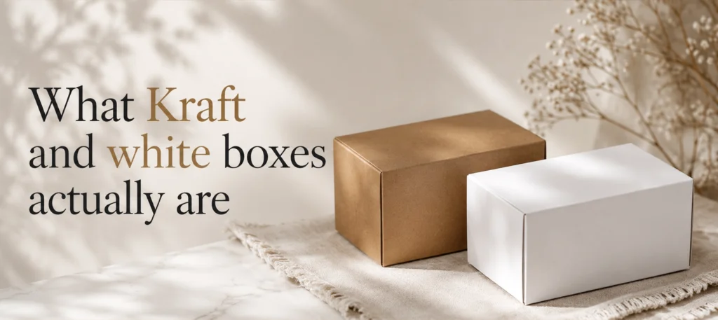
Kraft board is made from wood pulp that skips the bleaching stage, which is why it keeps its natural brown colour. It often carries a high share of recycled fibre. White board is either bleached board (bright white all the way through) or “white-top” kraft, which is a white printing surface bonded onto a brown recycled base.
Both come in the same box styles. You can order a kraft mailer or a white mailer, a kraft tuck-end carton or a white one. Strength doesn’t change with colour either. A box’s rigidity comes from the board grade and fluting (the wavy corrugated layer), not the pigment. A white shipping box protects exactly as well as a brown one of the same spec.
So the choice comes down to three things: how your print looks, what story the material tells, and price.
How the same artwork prints on kraft vs white
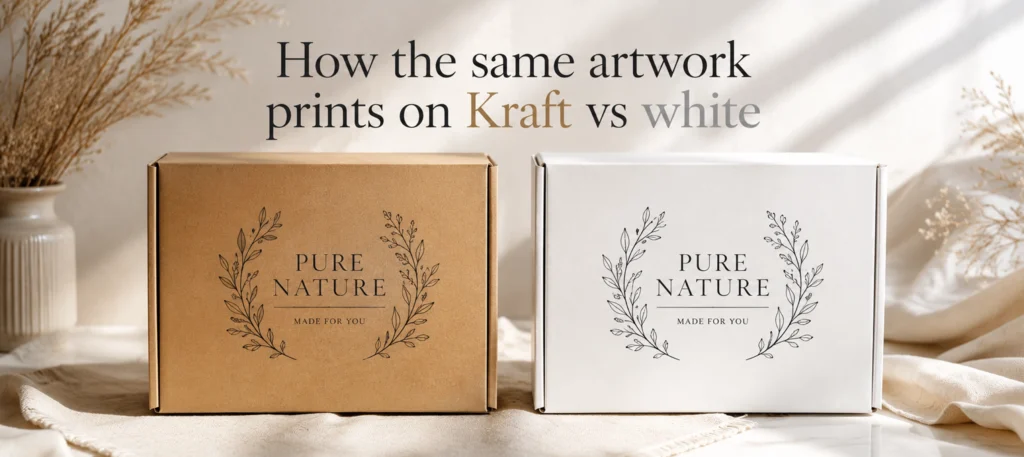
Here’s the part most comparison guides skip, and it’s the one that decides whether you’ll love your boxes. On white board, ink sits on a bright, even base, so colours come out close to what you approved on screen. On kraft, you’re printing onto brown. Every ink layer mixes with that brown, because standard CMYK inks are semi-transparent.
The most common artwork fix we make on kraft jobs is exactly this: a customer sends a design full of soft pinks or bright yellows, and we advise switching to a single dark colour before it goes anywhere near the press. Uncoated kraft also drinks ink (printers call this dot gain), so fine detail and small text soften slightly.
Here’s how typical design elements behave on each board, from our own press results:
| Design element | On white board | On brown kraft |
|---|---|---|
| Bright yellow or orange logo | True to your proof | Shifts olive and dull |
| Pastel background | Soft and accurate | Barely visible |
| Product photograph | Sharp, natural tones | Darker, with a warm brown cast |
| Solid black or navy print | Crisp | Crisp, and looks superb |
| White text | Printed by leaving the area blank | Needs an opaque white ink pass |
| Gold foil | Pops against clean white | Gorgeous against warm brown |
There is a workaround: a white ink underprint, an opaque white layer printed beneath your colours on kraft. It rescues brightness, though it adds cost and never quite matches the brilliance of a true white board. If your design genuinely needs vivid colour, white board is the honest recommendation.
The honest sustainability comparison
Kraft is not automatically the green choice, whatever the marketing says. Both kraft and uncoated white board are paper based and both go in the same UK kerbside recycling bin. The Confederation of Paper Industries puts UK paper and board recovery for recycling at around 70%, one of the highest rates of any packaging material.
Where kraft genuinely earns its reputation: it usually contains more recycled fibre, and skipping the bleaching stage means less processing. If that’s your story, tell it properly. “Made with 85% recycled fibre, recyclable at kerbside” is a claim customers can check. “Eco-friendly” on its own is not.
One caveat here, and it catches people out: finish matters more than colour. A kraft box wrapped in plastic lamination is harder to recycle than a plain white one. If easy recycling is the goal, ask for uncoated board and water-based inks, whichever colour you pick.
UK packaging rules add a practical reason to care. Extended Producer Responsibility (EPR) fees are weighted by how recyclable your packaging is, so an easily recycled paper box costs less to comply with than a laminated one. Check GOV.UK for the current rules, as the fee structure is still being adjusted.
For the wider material picture, including compostable and biodegradable options and what those terms legally mean, see our guide to different types of biodegradable packaging.
What kraft and white boxes cost
Kraft is usually cheaper, but the gap is smaller than most first-time buyers expect. As a rough guide from our own quote desk, for a printed mailer box around 229 x 152 x 76 mm:
| Quantity | Brown kraft (per unit) | White board (per unit) |
|---|---|---|
| 100 units | £1.55 – £1.75 | £1.70 – £1.95 |
| 250 units | £1.15 – £1.30 | £1.25 – £1.45 |
| 500 units | £0.90 – £1.05 | £1.00 – £1.15 |
Treat these as illustrations, not a price list. Prices vary by size, quantity, board grade and print method, and a white ink underprint on kraft can cancel the saving entirely. That last point surprises people: kraft plus white underprint often costs more than simply printing on white board.
The economics improve at volume, and you don’t need big-brand quantities. Our minimum order is 100 units either way, with free design support, free 3D mockups and free UK delivery, so testing both boards on a small run is a realistic option rather than a gamble.
Matching the box to your brand personality
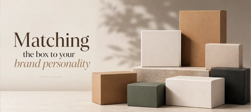
Ask yourself three questions before choosing.
What should customers feel when the box arrives? Kraft says handmade, honest, earthy. It suits candles, soap, coffee, farm produce and handmade jewellery. White says considered, clean, premium. It suits skincare, cosmetics, tech accessories and patisserie. Neither is better. A luxury serum in a brown box can read as cheap; a rustic soap bar in a clinical white box can feel soulless.
What does your visual identity need? Pull up your brand colours. Mostly dark, muted or monochrome? Kraft will flatter them. Built on pastels, brights or photography? You need white. We once printed a pastel-heavy skincare design on kraft at the customer’s insistence; the sample video call was short, and the reorder was on white board.
What story are you telling? If sustainability leads your marketing, kraft’s visible recycled fibre backs the message before anyone reads a word. If craftsmanship or science leads, the precision of print on white board carries it. Your box should repeat your story, not contradict it. We cover this thinking in more depth in how to design product packaging that sells.
Don’t forget black kraft and white kraft
The choice isn’t strictly binary, and two variants solve the classic dilemmas.
Black kraft is kraft board dyed through with a deep charcoal-black colour. It photographs beautifully and turns a simple white or metallic ink print into something that looks far more expensive than it is. Small jewellery and candle brands use it to get a luxury feel without rigid-box prices.
White kraft (bleached kraft, or white-top kraft with a recycled brown core) is the compromise pick. You keep the uncoated, tactile kraft character and much of the recycled-content story, but gain a brighter surface that prints colour far better than brown. We run custom printed kraft boxes in brown, black and white kraft, so you can sample all three against your artwork.
FAQ: kraft vs white boxes
Is kraft packaging cheaper than white?
Usually, yes. Kraft skips the bleaching stage, so like-for-like boxes run roughly 10-15% cheaper. The exception: if your kraft design needs a white ink underprint for colour accuracy, that extra pass can make it cost more than printing on white board.
Can you print full colour on kraft boxes?
Yes, but colours won’t match your screen. Standard CMYK inks are semi-transparent, so the brown base mutes them: yellows turn olive and pastels almost disappear. Dark colours print well. For bright, accurate colour on kraft, you need a white ink underprint, which adds cost.
Is white cardboard recyclable in the UK?
Yes. Uncoated white board goes in the same kerbside recycling as brown kraft, and the UK recovers around 70% of paper and board for recycling. What blocks recycling isn’t colour but finish: plastic lamination or heavy foil coverage makes any box harder to process.
Which looks more premium, kraft or white?
White reads as premium for most product categories, especially cosmetics and skincare, because it prints crisp, accurate colour. Kraft reads as premium in artisan categories like coffee and candles, where the natural texture signals craft. Black kraft with white or gold ink is a strong budget-luxury option.
Are white boxes weaker than kraft boxes?
No. Strength comes from the board grade and the fluting, not the colour. A white corrugated shipping box with the same specification protects exactly as well as a brown one. Choose your board weight for the product; choose the colour for the brand.
What is white kraft?
White kraft is kraft board that’s either bleached or made with a white printing surface over a recycled brown core. It keeps kraft’s uncoated, natural texture but gives inks a brighter base, so printed colours stay much closer to your approved design.
Key takeaways
- Kraft suits natural, handmade and eco-led brands; white suits colour-led, minimalist and premium brands.
- The print result is the biggest practical difference: bright and pastel colours need white board or a costly white underprint.
- Strength is identical at the same board spec; colour changes nothing structural.
- Both recycle at kerbside in the UK. Base any eco claim on recycled content, certification and finish, not the colour.
- Expect kraft to be roughly 10-15% cheaper like for like, with prices varying by size, quantity and print.
- Black kraft and white kraft cover the gaps when neither classic option quite fits.
Still torn? The cheapest way to settle it is to see your own artwork on both boards. Send us your design for a free quote and 3D mockup and we’ll show you how it looks on kraft and white before you commit to either, from 100 units.